Understanding the Color Matching Dilemma
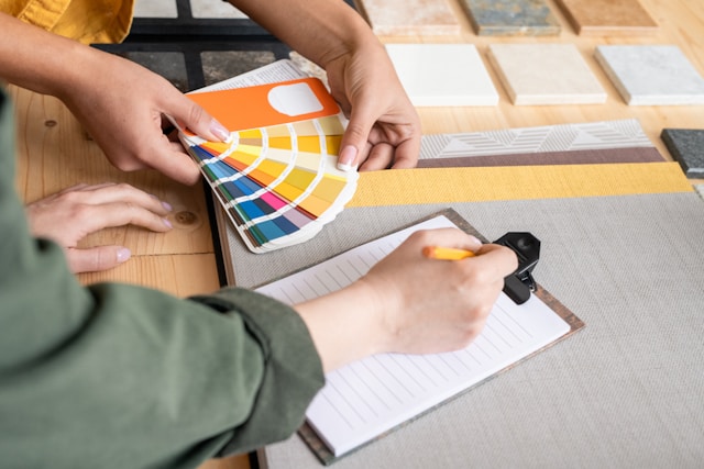
Achieving consistent color across different materials like fabric, metal, and wood is a complex process influenced by various factors, from material properties to lighting conditions. Each material interacts with color and light uniquely, creating variations that can dramatically affect how a color appears. When this challenge shifts to an online environment, where digital screens replace in-person samples, the complexity increases even more.
1. Material-Specific Characteristics: Texture, Finish, and Light Interactions
Texture Variance: Each material has a unique surface texture that affects how color appears to the human eye. For example, fabrics tend to have woven textures that diffuse light, creating a softer, less reflective color appearance. Metals, especially those with polished finishes, reflect more light, giving colors a sharper, more vibrant look. Woods, with their natural grains and inconsistencies, often reveal subtle variations in color that add depth but can make precise matching with other materials difficult.
Finish and Sheen: The finish of a material—whether glossy, satin, or matte—plays a crucial role in color perception. A glossy finish on a metal fixture can make a color appear brighter and more saturated, while a matte finish on a wooden table in the same color will give a softer, more muted appearance. Even small shifts in finish can significantly affect how colors relate to one another.
Light Absorption and Reflection: Different materials absorb and reflect light in varying ways, which can dramatically alter how a color is perceived. Metals and other polished surfaces tend to reflect a large amount of light, often appearing brighter or with a cooler undertone. Fabrics typically absorb more light, creating a warmer or more subdued color tone. Wood, with its natural grain and texture, can vary even within the same type, displaying different shades depending on the angle and lighting.
These factors make it challenging to match a color across materials. A navy-blue fabric might look perfectly matched to a metal fixture in one lighting scenario, but under different lighting or when viewed at an angle, the color can shift in ways that cause the two elements to appear mismatched.
2. The Role of Lighting in Color Perception
Natural vs. Artificial Lighting: The type of light significantly impacts how colors are perceived. Natural light, which changes throughout the day, can cause materials to look cooler in the morning and warmer in the afternoon, adding variability. Artificial lighting, whether warm-toned or cool-toned, also changes color appearance, often enhancing or dulling certain shades depending on the light's color temperature.
Direct vs. Diffused Light: Direct lighting, such as spotlighting, creates sharp contrasts and can accentuate differences between colors, while diffused lighting (like ambient room lighting) softens colors and reduces contrast. For instance, a metal fixture under direct lighting may appear brighter and more reflective, while a fabric sofa under diffused lighting may look softer and warmer, even if they are intended to match.
Metamerism: Metamerism is the phenomenon where colors appear to match under one light source but differ when seen under another. This is particularly relevant when trying to match different materials, as metals, fabrics, and woods each respond differently to varying light wavelengths. Online shoppers who purchase based on images taken under specific lighting conditions may be surprised when the actual colors appear different in their own spaces.
3. Digital Limitations of Color Representation
Screen Technologies: Color accuracy varies significantly across different display technologies, such as LCD, LED, and OLED screens. OLED screens, for instance, produce richer blacks and higher contrast, which can make colors appear more saturated compared to LCD screens that may display colors with less vibrancy. This variation makes it hard for customers to know whether they're seeing a true-to-life representation of a color.
Screen Calibration: Each device—whether a laptop, desktop, or smartphone—has its own screen calibration settings, including adjustments in brightness, contrast, and color balance, all of which can shift how colors appear. A soft beige on a calibrated designer's monitor could appear as a yellowish tone on a non-calibrated tablet. Customers are often unaware of these differences, leading to mismatches between what they see online and what they receive.
Ambient Screen Lighting: The lighting environment in which a device is used also affects color perception. A brightly lit room may wash out colors on a screen, while viewing under low lighting can intensify color contrast. This means the same color viewed on the same device may appear differently depending on whether the user is in a naturally lit office or a dimly lit living room.
4. Color Systems Tailored to Specific Applications
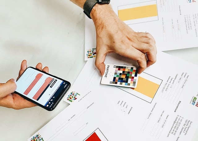
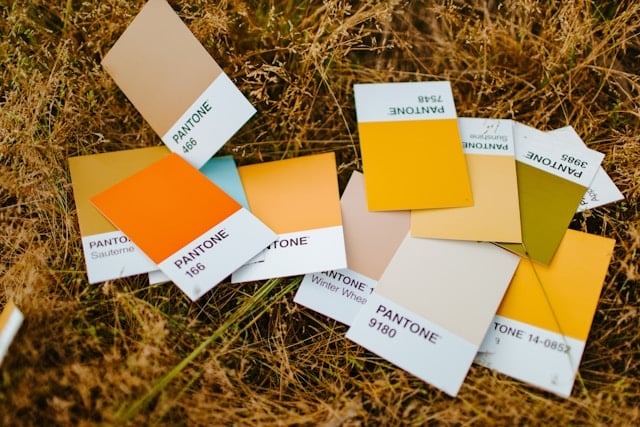
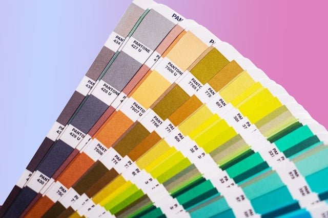
Distinct Color Standards for Different Materials: Different color systems were developed for specific materials and industries, making cross-material matching difficult. The Pantone Matching System (PMS), for example, is widely used for fabrics and print media, while RAL colors are often used for paints, coatings, and industrial materials. These systems are optimized for their respective applications, meaning a Pantone color for a fabric may not translate perfectly to a RAL color for metal or paint.
Conversion Limitations: Translating colors from one system to another doesn't always result in an exact match. While some color codes can be approximated, each system's unique characteristics mean that a perfect translation is often impossible. For example, a Pantone "navy blue" might have a subtle warmth that doesn't exist in the closest RAL equivalent. This makes achieving a true color match across materials difficult, particularly when relying on digital representations alone.
5. The Influence of Individual Screen Settings and Personal Perception
Device-Specific Settings: Beyond calibration, most users adjust screen settings to their personal preferences, often without realizing the effect this has on color. Increased brightness, contrast, or color warmth settings can shift the appearance of colors, making it hard for designers to ensure that customers are seeing accurate representations.
Perception Based on Surrounding Colors: Color perception is influenced by surrounding colors and the viewing environment. When customers look at a blue fabric online, the color may appear cooler or warmer depending on the surrounding digital elements, such as the website's background color. This effect, combined with individual screen settings, further complicates the goal of accurate color matching online.
These factors illustrate the complexity of achieving color consistency across different materials when shopping online. The varying ways that materials reflect and absorb light, the challenges of digital screen technology, and the limitations of industry-specific color systems all contribute to the color-matching dilemma. Recognizing these challenges is the first step toward developing solutions that can help architects, designers, and consumers make more confident, informed choices in an increasingly digital design landscape.
As we've explored, matching colors accurately across different materials when shopping online is a complex task influenced by material characteristics, lighting conditions, and digital limitations. Understanding these challenges is essential for designers, architects, and homeowners aiming to create cohesive and harmonious spaces. In the next article, "The Impact of Screen Technology on Color Perception," we'll examine how different screens and devices affect how colors appear online. By recognizing how screen technology influences color perception, you can make better-informed decisions in your digital design endeavors.
Stay tuned to learn more about navigating these challenges in your online sourcing journey.


