Overcoming Colour Matching Challenges in the Digital Age: Insights for Architects and Interior Designers
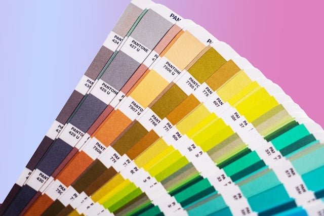
Color plays a fundamental role in shaping our experiences within a space, influencing not only aesthetic appeal but also mood, functionality, and perceived harmony of an environment. In architecture and interior design, selecting the right color palette is often one of the most significant decisions a designer or homeowner will make. It’s not simply about choosing hues that look pleasing color impacts how a space is perceived in size, temperature, and even comfort.
The psychological effects of color are well-documented: warm tones such as reds, yellows, and oranges are often associated with energy and vitality, making them popular choices in communal spaces like living rooms and dining areas. Cooler tones like blues and greens can evoke calm and relaxation, fitting for bedrooms, bathrooms, and personal retreats. Neutral colours, in turn, create versatile foundations, balancing bold accents or helping showcase materials and architectural details.
In commercial and residential projects alike, color choices directly influence how a space will be experienced and lived in. Designers strive for not just individual color selections but for a cohesive palette that reflects the intended atmosphere, functionality, and purpose of a room. A vibrant color scheme, for example, can draw attention to focal points, highlight textures, or create visual flow, while a subtle palette might be ideal for a minimalist, open concept design.
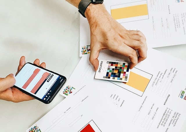
However, as the design and sourcing process moves increasingly online, ensuring accurate color representation has become a considerable challenge. Unlike the traditional experience of browsing color samples in showrooms or matching physical swatches, online sourcing introduces the complexities of digital screens, varied display technologies, and lighting environments. This makes it challenging to achieve a consistent match, particularly across different materials like metal, fabric, wood, and paint.
This article delves into the challenges of online color matching for architecture and interior design and explores solutions that can help achieve greater accuracy and satisfaction for buyers. From leveraging color-matching technologies to employing digital visualization tools, we will explore practical approaches to help designers and customers create the perfect color harmony, no matter the medium or device.
1- The Challenges of Colour Accuracy in Online Shopping
Online shopping has revolutionized how designers, architects, and homeowners source construction materials and furniture. The convenience of browsing and comparing options from various suppliers at any time and from anywhere allows for a faster, more streamlined decision-making process. This digital shift has opened new possibilities for both residential and commercial projects, enabling a broader range of choices and easier access to materials from around the world.
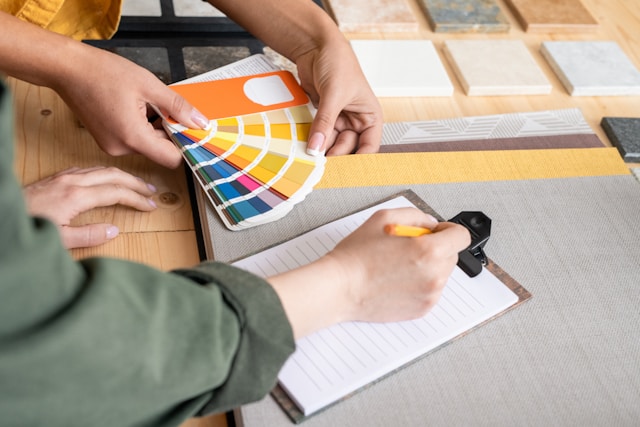
However, while the advantages of online shopping are numerous, it introduces a significant challenge when it comes to color accuracy. In a traditional showroom or design center, a designer or customer can view materials and colors in person, assess their true appearance under varied lighting, and compare samples side-by-side. This hands-on experience enables a level of precision and confidence in color matching that’s hard to replicate online.
Without physically seeing a product, it’s difficult to gauge how a particular shade or finish will look once installed or combined with other elements in a space. Different materials (such as metals, fabrics, and woods) interact uniquely with light and reflectivity, affecting how colors appear in person. For example, a cool gray fabric might match a matte-finish metal in-store, but online, the two could appear very different due to the limitations of digital color rendering.
Additionally, color perception varies widely across devices. The same color viewed on a smartphone, laptop, or desktop screen can look different depending on each screen’s display technology, resolution, and even the ambient lighting in the user’s environment. Variations in brightness, contrast, and screen calibration make achieving a true-to-life color representation difficult, often leaving online customers uncertain about how well their selections will fit into their overall design scheme.
This challenge is even more pronounced in construction materials, where factors like texture, finish, and durability play essential roles in how a product will look and feel in a completed space. Paints, tiles, fabrics, and metals each present unique challenges in color matching due to their physical properties. As a result, customers shopping for these items online often find themselves seeking solutions to ensure color consistency across different materials.
In the following sections, we will explore the complexities of online color matching and provide practical solutions that can help designers, architects, and homeowners make more informed color choices, even in a digital shopping environment.
2- The Problem of Colour Matching Across Different Materials in Online Shopping
When designing a cohesive space, matching colors across various materials—such as metals, fabrics, woods, and paints—is essential to achieving a unified aesthetic. But this task, already challenging in person, becomes exponentially harder when shopping online. Unlike a traditional setting where materials can be assessed side-by-side, digital shopping requires users to trust screen representations that may not accurately reflect real-world colors.
One key reason color matching is difficult is the inherent difference in how various materials interact with light. Each material has its unique properties—like texture, gloss, and depth—that affect color perception. Metal surfaces, for example, often have a reflective quality that can alter the appearance of a color depending on the angle of view and light source. Fabric colors, on the other hand, can vary widely based on weave density, material composition, and lighting. Paints offer another layer of complexity, as they can look distinctly different in matte, satin, or gloss finishes. Even wood, with its natural grains and variations, presents its own set of challenges in color consistency.
Another factor is light absorption and reflection. Metals and polished surfaces reflect more light, which can make colors appear brighter or even cooler. Fabrics typically absorb more light, making colors appear softer or warmer. This difference becomes evident when trying to match a fabric-covered piece of furniture with a metal accent or fixture. Even if the base color matches, the different ways these materials respond to light can make them look misaligned.
The digital limitations of color representation add another layer of complexity. Screens display color using RGB (Red, Green, Blue) values, which work well for digital images but don’t fully capture the nuances of physical materials. Each device type—whether it’s a smartphone, tablet, or desktop computer—interprets these RGB values differently, often leading to color inconsistencies. As a result, a gray fabric may appear as a warmer or cooler shade depending on the screen settings, and the texture and depth that make the color dynamic in real life may be lost entirely.
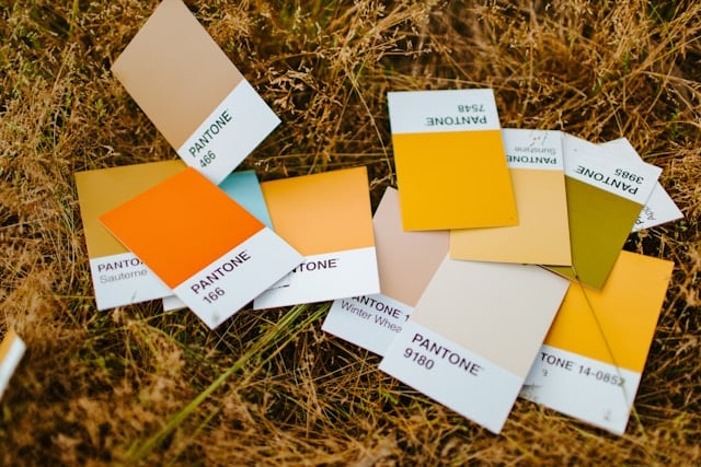
These issues are compounded by color systems designed for specific materials. For example, RAL colors are commonly used for industrial coatings and paints, while Pantone colors are popular in textiles. Each system is tailored for different applications and materials, and they don’t always translate perfectly across mediums. This means that a Pantone color matched for a fabric may not have an identical counterpart in the RAL system for metal finishes, making it difficult to ensure precise color harmony between these materials.
The challenge of color matching across materials when shopping online is thus a blend of technical limitations, material properties, and digital variance. As the design process increasingly moves online, finding effective solutions for color accuracy across materials becomes critical for designers, architects, and homeowners alike. In the following sections, we’ll look at strategies that can help bridge these gaps and bring us closer to accurate, reliable color representation in the digital space. Matching colors accurately across different materials online is a complex task, but it's vital for creating cohesive designs. The unique way each material interacts with light, combined with the limitations of digital displays, makes this process challenging. In our next article, "Understanding the Colour Matching Dilemma," we'll dive deeper into why matching colors online is so tricky. We'll discuss how material characteristics, lighting conditions, and the digital environment contribute to these difficulties. By understanding these factors, designers, architects, and homeowners can make better choices in the digital space to create harmonious designs. Keep reading to discover practical solutions and strategies to overcome color matching challenges in your online sourcing journey.


